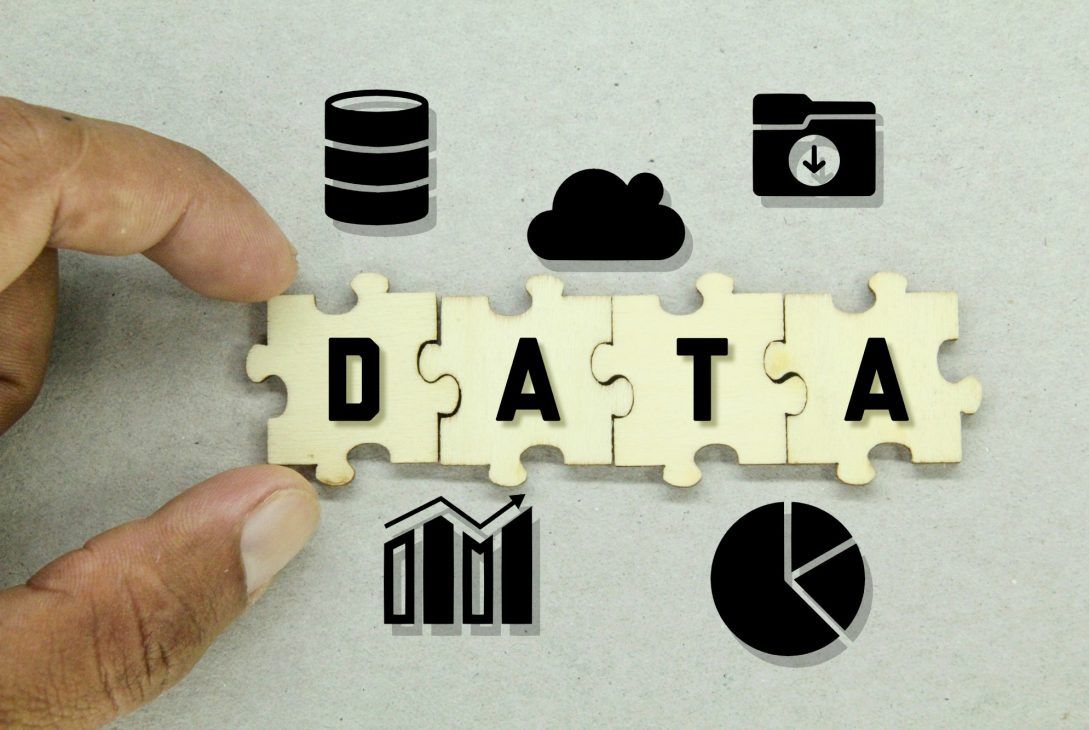
Data visualization is a powerful technique that transforms raw data into insightful and easily understandable visuals. For businesses and organizations, data visualization plays a crucial role in decision-making, uncovering patterns, and communicating complex information effectively.
In this blog, we will explore the top seven exclusive tools for data visualization that offer unique features and capabilities to help you harness the full potential of your data.
- Tableau: Tableau is one of the leading data visualization tools in the market, renowned for its user-friendly interface and advanced features. It allows users to create interactive and dynamic dashboards, charts, and graphs, empowering them to explore data from multiple angles. With Tableau, you can connect to various data sources, perform real-time data analysis, and share visualizations effortlessly. Its drag-and-drop functionality makes it accessible to users of all skill levels.
- Power BI: Microsoft Power BI is a versatile data visualization tool that integrates seamlessly with Microsoft’s suite of products. It offers a wide range of visualizations and customizable dashboards that enable users to extract valuable insights from their data. Power BI also supports natural language queries, making it easy to interact with data using simple language commands. Its cloud-based service allows for real-time collaboration and sharing of reports across teams and departments.
- QlikView: QlikView is a data visualization and business intelligence tool that emphasizes associative data modeling. It enables users to explore data relationships intuitively, promoting a deeper understanding of information and facilitating data discovery. QlikView’s in-memory technology ensures fast data processing and responsiveness, making it an excellent choice for real-time data analysis and interactive dashboards.
- D3.js: D3.js is an open-source JavaScript library that provides a highly customizable and flexible platform for data visualization. As a developer-centric tool, D3.js offers complete control over the visual elements and interactivity of your graphs and charts. It’s ideal for creating unique and tailored data visualizations, and it supports a wide range of data formats, making it compatible with almost any data source.
- Plotly: Plotly is a powerful data visualization library that supports multiple programming languages, including Python, R, and JavaScript. It offers a wide range of interactive and visually appealing charts, graphs, and maps. Plotly’s strength lies in its versatility, as it can be used both as an online platform and an offline library. Its collaborative features make it an excellent choice for teams working on data-driven projects.
- Looker: Looker is a data visualization and business intelligence platform that offers a centralized space for data exploration and analysis. It provides a user-friendly interface, making it accessible to business users without specialized technical skills. Looker integrates with various data sources, allowing users to create data models, visualizations, and reports without the need for complex SQL queries. Its powerful collaboration features foster data-driven decision-making across the organization.
- Sisense: Sisense is a data visualization tool that emphasizes data integration and analytics. It enables users to connect, analyze, and visualize data from various sources quickly. Sisense’s Elasticube technology ensures high-speed data processing, making it suitable for handling large datasets. Its AI-driven analytics feature helps users discover hidden insights and patterns within their data, enabling data-driven decision-making.

Conclusion
Data visualization is a crucial aspect of data analysis that allows businesses to make informed decisions and gain valuable insights from their data. The seven exclusive tools mentioned in this blog – Tableau, Power BI, QlikView, D3.js, Plotly, Looker, and Sisense – offer powerful features, exceptional flexibility, and user-friendly interfaces that cater to diverse data visualization needs. Whether you are a data scientist, business analyst, or developer, these tools provide the means to unlock the full potential of your data, and stay ahead in an increasingly data-driven world. Choose the one that best aligns with your requirements, and elevate your data visualization capabilities to new heights.
Related Posts: